Graphic Rating Scale: Expert Guide + Template
Giving feedback is difficult! Our human experience today includes constant requests for survey participation, post-sale feedback, and even our perception of bathroom cleanliness at an airport.
Jumping into our HR world, the major feedback activity is the dreaded employee performance review. Managers hate writing them, employees brace themselves to receive them, and HR hopes the whole thing doesn’t spiral into another “we’ll do better next year” conversation.
That’s where tools like the graphic rating scale are used ti structure and consistency to proceedings.
In this article, I’ll walk you through how the graphical rating scale method works, advantages and disadvantages, and some best practices for utilizing it effectively.
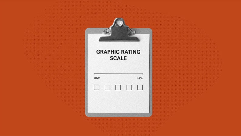
What Is a Graphic Rating Scale?
A graphic rating scale is a performance appraisal method that uses a visual scale—usually numbers, words, and/or symbols—to measure an employee’s performance or specific traits.
For example, you might rate “quality of work” on a scale from 1 (poor) to 5 (excellent). That score doesn’t tell the full story of someone’s overall performance, but it gives you a measurable starting point.
The aim is to create a consistent way to track performance over time, compare across employees, and make decisions based on performance information.
The scale works especially well in roles where certain employee behaviors like reliability, accuracy, or teamwork need to be measured across individuals and teams.
How The Graphic Rating Scale Works
The beauty of the graphic rating scale is its simplicity and intuitiveness.
You start by picking a trait or behavior that’s important in the role and then rate it along a defined range.
That range could be numbers, words, or even symbols. Then comes the rating itself. Managers (and sometimes peers) go through each trait and mark where the employee lands. For example, “Reliability = 4” or “Teamwork = Excellent.”
Once ratings are collected, they become part of the larger employee performance evaluation. Managers can:
- Compare results across team members to spot patterns.
- Track scores over time to see where someone is improving or slipping.
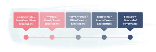
- Use the scores as a springboard for coaching conversations. For example, if an employee scores “below average” in reliability but “excellent” in teamwork, the manager has both a red flag and a strength to address.
- Roll the results into an overall performance rating that feeds into the organization’s appraisal system.
The beauty of the graphic rating scale is that it takes something as complex as performance and reduces it into a structure that managers and HR professionals can actually use.
The scale itself isn’t the final word, but it helps set the stage for more consistent, fair, and actionable performance conversations.
Different structures of the scale
The structure of the graphic rating scale can be built in different ways depending on your unique needs.
Numeric
The most common option, like a 1-5 or 1-10 scale. For example, you might rate “customer service responsiveness” as a 4 out of 5.
The advantage here is that the results can be averaged, compared, and tracked over time.
If your sales team had an average “communication” score of 3.2 last year and 4.1 this year, you can see measurable progress.
Numeric scales are clean and data-friendly, but they can feel cold if there’s no context behind the numbers. Still, they remain the most common rating system in HR.
Descriptive
Instead of numbers, you use words like poor, fair, good, excellent. This adds some clarity because “excellent” is easier to interpret than a “5” without context.
For instance, if you’re evaluating reliability, a manager might mark “good” for someone who usually meets deadlines but occasionally slips.
The downside is that without clear definitions, one manager’s “good” might be another manager’s “fair.”
Symbolic
Icons such as stars, smiley faces or checkmarks symbolize performance. These are often used in customer surveys but can also make employee feedback feel a tad more approachable.
For example, a retail team might use smiley faces to track customer satisfaction on a daily basis, while HR might use stars to rate peer-to-peer recognition.
The risk is that symbols feel casual, which can be great for engagement but less useful if you need precise performance data. Just be sure to calibrate your performance evaluations across individuals and teams, especially if using a symbolic graphical rating scale to measure employee performance.
Common rating categories
Not every trait works equally well with the graphic rating scale method. The best categories are those that are observable, repeatable, and relatively easy to compare across team members.
In other words, if you can point to clear employee behaviors or outcomes, it usually makes sense to measure it on a scale.
Here are five traits that lend themselves well to graphic rating scales, along with guidance on how to structure them:
- Quality of work: How accurate, complete, or polished is the output? A designer might be rated on creativity and attention to detail, while a warehouse employee could be scored on error-free order fulfillment.
- Suggested Scale type: Numeric or descriptive
- Example: 1 = Frequent errors, 3 = Meets quality standards, 5 = Exceeds standards with outstanding attention to detail.
- Reliability: Can you count on this person to show up, meet deadlines, and follow through? For example, a project manager who consistently delivers on time would rate high, while someone who often misses deadlines would fall lower on the scale.
- Suggested Scale type: Descriptive
- Example: “Rarely dependable,” “Usually dependable,” “Always dependable.” Managers can select the option that best reflects attendance, punctuality, and follow-through.
- Communication: This can cover verbal, written, or digital communication. An “Excellent” communicator might clearly explain ideas in meetings and respond promptly to emails, while a lower score might reflect missed updates or unclear instructions.
- Suggested Scale type: Symbolic or descriptive (avoid numerical here, be specific in the definitions of symbols and descriptions as everyone’s expectations of communication and responsiveness are different)
- Example: Smiley face scale ( 🙁 😐 🙂 😀) to rate clarity and responsiveness, or descriptive options like “Poor,” “Average,” “Excellent.”
- Teamwork: Collaboration often makes or breaks success. A high score here might go to someone who willingly helps colleagues and contributes to team goals, while a lower score could signal conflict or reluctance to collaborate.
- Suggested Scale type: Numeric or symbolic
- Example: A 1–5 numeric scale where 1 = “Rarely collaborates” and 5 = “Consistently goes out of their way to support team goals.” Alternatively, use stars (★ to ★★★★★) in peer-review settings to make it more approachable.
- Productivity: How much gets done compared to expectations? For a call center rep, this might mean calls handled per hour; for a software engineer, it could reflect completed features or resolved bugs.
- Suggested Scale type: Numeric or descriptive
- Example: 1 = “Rarely meets targets,” 3 = “Consistently meets expectations,” 5 = “Regularly exceeds targets with high efficiency.”
Rating scale formats
Once you know what you’re measuring, you need to decide how to present it. The format matters because it shapes how easy the scale is to use and how meaningful the data will be later.
The worst outcome is when people don’t understand the scale and it is applied inconsistently, so this is probably the most important part of making graphic rating scales actually functional!
Linear
The linear format is the most familiar option. It’s a straight line or list of ratings, such as 1–5 or “poor to excellent.” Imagine a performance review form where you rate “teamwork” by circling a number from 1 (rarely collaborates) to 5 (excellent collaborator).
- When to use it:
- For quick assessments where speed matters.
- When you want to compare results across multiple employees.
- In customer feedback surveys, where people won’t spend more than 10 seconds filling it out.
- Example:
| Reliability | ||||
| 1 = Rarely dependable | 2 = Below average dependability | 3 = Usually dependable | 4 = Very dependable | 5 = Always dependable |

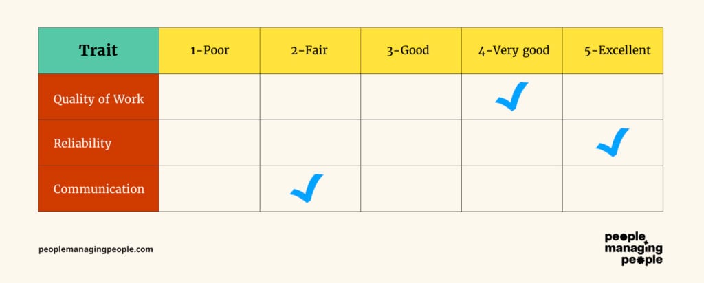
Matrix
The matrix format is a grid that lays out multiple traits against the scale points in one table. In this case, the scale for the traits are consistent (such as 1-5) but the various traits are all evaluated in a table.
Each row is a trait (like quality, reliability, communication), and each column is a score (such as 1–5). It looks a lot like a spreadsheet, and managers can fill it out in one view.
This format is especially useful for HR professionals managing large teams, since it gives a structured view across multiple job descriptions.
- When to use it:
- In annual performance reviews where you are evaluating multiple competencies at once.
- To see patterns across an employee’s strengths and weaknesses.
- For team-level analysis where you want to compare individuals across the same categories.
- Example:
Checklist
The checklist format skips the continuum and instead offers defined statements to choose from. For each trait, the manager ticks the box that best applies.
- When to use it:
- In roles with very specific expectations (like compliance, safety or technical tasks)
- For quick check-ins or probation reviews where nuance isn’t as important as yes/no clarity.
- In situations where different evaluators might interpret numbers differently, this option can flag when performance needs improvement.
- Example:

While these are just a few examples of how graphic rating scales can be created and formatted, the key is to focus on what your organization truly values and build scales around those factors.
Whatever you do, make sure everyone understands the scale and can use it effectively (train them on it). And don’t skip calibration! Take the time to check if people are really picking up what you’re putting down.
Advantages Of The Graphic Rating Scale
Graphic rating scales stick around because they’re simple, practical, and adaptable. Here are some of the main benefits:
Easy to use and understand
A manager doesn’t need specialized HR training to fill out a graphic rating scale. Circling a number from 1–5 or checking a box is straightforward. Employees also understand it right away—nobody needs a ten-minute explanation before the review starts.
Example: A retail store manager can rate five employees in under an hour, giving consistent feedback on reliability and customer service without overcomplicating the process.
Allows quick comparisons between employees
Graphical rating scales enable everyone to be rated on the same traits, making it easy to spot patterns.
Maybe your whole team is scoring high on teamwork but low on productivity, which tells you where to focus training or resources. Or you might notice one underperforming employee consistently falls below peers in reliability.
Example: In a customer service department, averages across the “communication” category can show which reps need coaching versus which should be tapped to mentor others.
Supports quantitative performance tracking
Numbers can be tracked over time and used for trend analysis. This is gold when you’re trying to justify HR decisions like promotions, raises, or additional training.
Example: If an employee’s “quality of work” score rises from 2 to 4 over three review cycles, you have data to support a promotion case.
Flexibility in use case
Graphic rating scales aren’t limited to annual reviews. They can be used in check-ins, goal tracking, peer reviews, and even external settings like customer surveys.
Example: A software company might use a numeric scale for employee goals during quarterly reviews, while also collecting customer satisfaction ratings with stars after each support ticket.
Disadvantages And Limitations
For all their convenience, graphic rating scales come with some real drawbacks. If you don’t design and use them carefully, they can create confusion or even unfairness.
Potential for rater bias
Without clear definitions, one manager’s “4” could be another’s “2.” Personal feelings, cultural differences, or unconscious bias can all skew results. The halo effect is especially common, where strength in one area influences ratings in others.
Example: A manager who has a strong personal rapport with an employee might rate them a “5” on teamwork, even if they don’t always contribute equally in group projects.
Lack of context in scores
A number or star rating doesn’t explain why someone scored that way. Without follow-up conversations, employees can walk away unclear about what they’re doing well or what they need to improve.
Example: Telling someone they’re a “3” in communication doesn’t explain if the issue is with emails, presentations, or responsiveness.
Not ideal for complex roles
Some jobs can’t be boiled down to a few traits on a scale. Leadership, strategic thinking, or creative work often requires more nuanced evaluation.
Example: Rating a software architect’s innovation on a 1–5 scale feels reductive. A narrative assessment or 360-degree feedback might give a fuller picture, especially if they are inventing something completely new.
Risk of oversimplification and uselessness
Context is everything, and people need real, valuable feedback with words, not just numbers. If you rely only on graphic rating scales, performance management can turn into nothing more than a spreadsheet of numbers.
That can be demotivating for employees, and doesn’t give managers enough insight to help people grow or re-align with their job description.
Example: An employee consistently scoring “4s” across categories might seem like they’re doing fine. But without conversations, you could miss that they’re burned out or under-challenged.
Examples of Graphic Rating Scales in Employee Performance Evaluations
There’s no single “right” way to design a graphic rating scale. The structure depends on what you want to measure and how much detail you need. Here are three common approaches, with examples:
1-to-5 numeric scale
This is the most straightforward version: rate each category on a numeric range.

When to use: Annual reviews, goal tracking, and anywhere you need clean data you can average or analyze across employees.
Descriptive word scale
Instead of numbers, descriptive words give more context and help describe what “good” looks like.
| Trait | Rarely Meets Expectations | Sometimes Meets Expectations | Consistently Meets Expectations | Exceeds Expectations |
| Teamwork | ☐ | ☐ | ☑ | ☐ |
| Productivity | ☐ | ☐ | ☐ | ☑ |
When to use: Roles where qualitative detail matters more than numeric averages, or when you want managers to think more carefully about the choice.
Symbolic scale example
Symbols make the scale more visual and often more approachable but, like with the numerical scale, they lack context and are wide open to subjectivity.
| Trait | 🙁 | 😐 | 🙂 | 😀 |
| Customer Service | ☐ | ☐ | ☑ | ☐ |
| Communication | ☐ | ☑ | ☐ | ☐ |
Or a star format:
- ★☆☆☆☆ = Poor
- ★★☆☆☆ = Fair
- ★★★★☆ = Very Good
- ★★★★★ = Excellent
When to use: Customer feedback, peer reviews, or informal recognition programs where a numeric or descriptive format might feel too formal.
How to Create a Graphic Rating Scale: Step-by-Step
Graphic rating scales require thoughtful design. A sloppy scale can create confusion or even bias, but a well-built one can make reviews more consistent and useful.
Here’s how to create one that actually works:
Step 1: Identify key performance criteria
Start by deciding what you actually want to measure. Think about the traits or outcomes that matter most in your organization and which are necessary for successfully completing the job according to the job description. For example, quality, reliability, teamwork, or specific employee goals.
Don’t overload the scale; 5–7 focused traits are plenty. Personally, I like to work with 4 focused traits that best align with the job description.
Example: A call center might choose “communication,” “problem-solving,” and “customer satisfaction” as core categories. A construction firm might focus on “safety,” “productivity,” and “teamwork.”
Step 2: Choose the rating format
Decide whether you’ll use a numeric, descriptive, or symbolic scale. For roles where you need measurable data across teams, numeric works best. If clarity matters more than averages, use descriptive wording.
For informal surveys or customer feedback, symbols are often the way to go. If you’re creating a scale for an entire organization, consider a descriptive scale with clear, detailed descriptions (keep reading to learn how to define it).
Example: In a professional services firm, numeric scales might be used in annual reviews for clean data. Meanwhile, a customer service department could use star ratings after each support ticket.
Step 3: Define scale levels clearly
This is where many organizations trip up. If you don’t define what each level means, one manager’s “good” might be another’s “excellent.” Spell it out with clear descriptions.
Example for Reliability:
- 1 = Rarely dependable, frequently misses deadlines
- 2 = Sometimes dependable, often misses deadlines
- 3 = Usually dependable, occasionally misses deadlines
- 4 = Typically dependable, meets deadlines
- 5 = Always dependable, consistently meets or beats deadlines
The more concrete your examples, the more consistent the ratings will be across managers.
Note that if using this type of descriptive or numerical scales (as the example above is both), be sure to create a scale for each trait or behavior you are evaluating.
Here is an example of a real performance management scale that uses both numbers and descriptions along with definitions and examples.
This scale was applied across multiple traits and used as an overall job performance score. Note, this is a behaviorally-anchored scale with more info than a typical graphical rating scale.
| Score | Description | Definition | Examples |
| 1 | Not competent in role | Performing at a level that is taking resources from other areas (due to supervision, training, quality or timeliness) | First 30-60 days of employment, needs constant supervision and all work QA’d, not fully committed to delivery standards in role. Note: An employee in the first 30-60 days of their role should not receive a formal performance evaluation. Contact HR to skip this process. |
| 2 | Partially competent in role | Performs most functions of the role but may still be learning. Could be struggling with on time completion or completeness. | Newer to role or role has changed, struggling in the role due to skills or changed expectations. Needs more supervision and QA than fully competent employees in the role. |
| 3 | Fully competent in Role | Performs job function as designed with consistent quality and outcomes. Requires little or no supervision. Can serve as a role model for this role due to competency. | In role for more than 120 days or has performed similarly prior to high standard. Requires little supervision. Can be relied on to train others in a similar role. |
| 4 | Moved the department forward with performance in role | Fully competent in role and went beyond required role during performance period. Performance is easily recognizable as changing the department for the better (new processes implemented, better idea, reduced toil, etc) | Highly competent in the role. Took on additional duties during the performance period, led a significant departmental project or is ready for a promotion. |
| 5 | Moved the company forward with performance in role (and beyond) | Fully competent in role and contributed beyond role during performance period. Performance is easily recognizable as changing the organization for the better (can be measured in increased revenue, increased employee/customer satisfaction or decreased costs) | Highly competent in the role and driving constant improvements in all areas. High potential for next level work and/or led company changing initiative. |
Step 4: Train managers on consistent application
Even the best scale will fail if managers interpret it differently. Training should include practice scenarios where managers rate sample employees, then compare their reasoning. This calibration process helps build alignment.
Example: Give managers a scenario: “Employee consistently turns in work on time but sometimes requires reminders.” Discuss whether that’s a 3 or a 4 for reliability and agree on a standard.
Step 5: Review and adjust based on feedback
After your first cycle using the scale, gather input. Did managers find it easy to use? Did employees feel the scores reflected reality? Were any categories confusing? Use that feedback to tweak wording, adjust the number of traits, or improve definitions.
Yes, you can change your evaluation methodology and process. No, you don’t have to do it the same way as last year so you can compare. Better evaluation methods now are much more valuable than historical comparisons.
Example: An organization that initially used a 1–10 numeric scale might switch to 1–5 after realizing managers were splitting hairs between “6” and “7” with no real difference.
When To Use A Graphic Rating Scale In Performance Management
Graphic rating scales are not the silver bullet to your employee review woes, but there are situations where they can really shine. Here are three of the most common uses:
- Annual Performance Reviews: When you develop and use a standardized scale, graphical rating scales work well in formal review processes where every employee is evaluated on the same traits. This makes it easier to compare performance across teams and track improvement year over year.
- Skills Assessment: Scales can also be used to measure specific skills tied to employee individual, team or company goals. This is especially helpful for roles where technical ability or proficiency is required.
- Customer Service Evaluations: Customer-facing teams benefit from quick, simple evaluations that provide measurable feedback. Graphic rating scales are often used in post-service surveys or quality audits of service calls. You might even see an invitation to complete a service evaluation on the bottom of your receipt from a physical store!
Alternatives To The Graphic Rating Scale
Graphic rating scales are popular because they’re simple, but they’re not always the right tool. Depending on your goals, you might consider these alternatives:
Behaviorally anchored rating scales (BARS)
Like in the example above, BARS take the traditional scale and give it teeth by attaching each point to a specific, observable behavior. Instead of leaving managers to interpret what “good” or “excellent” means, BARS spell it out clearly.
This reduces subjectivity and helps employees understand exactly what performance looks like at each level.
Example for Teamwork on a 1–5 scale:
1 = Rarely contributes in group settings, often resists collaboration
2 = Occasionally participates but may need prompting, reluctant to compromise
3 = Participates in team discussions, generally cooperative, completes assigned tasks
4 = Regularly collaborates, seeks input from others, helps the team reach consensus
5 = Actively encourages collaboration, mentors teammates, resolves conflicts constructively
In BARS, each score is anchored in behavior, two managers are more likely to rate consistently. The tradeoff is that BARS take significant time and effort to design, since you need to define behaviors for every trait and every point on the scale.
They’re best used for roles where precision matters (think leadership, customer-facing positions, or jobs where bias could have serious consequences).
Management by objectives (MBOs)
Management by Objectives shifts the focus away from rating traits or behaviors and instead zeroes in on whether employees meet specific, measurable goals.
The goals are typically agreed upon by both the employee and their manager, making this a more collaborative and forward-looking approach. MBOs focus on the what instead of the how.
Example MBOs for a Sales Role:
- Goal 1: Close $500,000 in new business within the quarter
- Goal 2: Retain 90% of existing clients
- Goal 3: Increase average deal size by 15%
At the end of the cycle, performance is measured by how well these objectives were met: fully achieved, partially achieved, or not achieved.
MBO works well for jobs with tangible outcomes such as sales quotas, project deliverables, or productivity targets. It’s highly motivating because employees know exactly what success looks like.
The challenge, however, is that it can overlook broader qualities like teamwork, leadership, or innovation if those aren’t baked into the objectives. In other words, evaluation just on MBOs can create a toxic environment where everyone is chasing a goal and doesn’t care how many people they piss off in the process.
While this is a pretty terrible approach, in my experience, leading with MBOs as goals mixed with behavioral evaluations seem to balance out the vibe.
Critical incident method
The Critical Incident Method takes a storytelling approach by focusing on specific instances of outstanding or poor performance. Instead of rating on a scale, managers document “critical incidents” over time, which then form the basis of a performance discussion.
Example for Customer Service:
- Positive incident: An employee stayed late to resolve a customer’s complex billing issue and received written praise from the client.
- Negative incident: An employee mishandled a service call, escalating the customer’s frustration and requiring intervention from a supervisor.
Critical incident documentation provides concrete evidence of performance, making feedback more credible and actionable.
It’s especially useful in roles where single actions can have major consequences (think healthcare, safety, or emergency response).
The downside is that it requires consistent recordkeeping. If managers fail to log incidents or only capture the negatives, the review can feel skewed and morale can be impacted.
Narrative/essay appraisal
The Narrative (or Essay) Appraisal method relies on a written description of an employee’s performance rather than structured ratings. Managers provide a detailed account of strengths, weaknesses, achievements, and areas for improvement, often in free-text form.
Example for Marketing:
- Positive note: The employee developed a social media campaign that exceeded engagement goals by 40% and successfully coordinated cross-team collaboration.
- Constructive note: The employee sometimes missed internal deadlines due to overcommitting to multiple projects at once.
Narrative appraisals allow for a rich, personalized picture of performance that captures nuance, context, and growth potential. They can be particularly valuable for smaller teams, creative roles, or organizations emphasizing development over strict measurement.
The downside is that they are subjective, time-consuming, and difficult to compare across employees. Two managers may write very differently, and without a standardized format, it’s challenging to ensure fairness and consistency.
Ranking/paired comparison
The Ranking method evaluates employees by ordering them from best to worst on overall performance, while Paired Comparison goes further by comparing each employee against every other in pairs to determine relative standing.
Example for Sales:
- Ranking: A manager places five sales reps in order based on total revenue generated, with Rep A at the top and Rep E at the bottom.
- Paired Comparison: Each rep is compared head-to-head with every other rep; Rep A may be judged “better” in 4 out of 4 comparisons, while Rep C may only come out ahead in 1 out of 4.
This method provides a clear picture of relative performance, making it useful when organizations need to make promotion, bonus, or layoff decisions. It forces differentiation, which can be especially valuable in highly competitive or results-driven roles.
The downside is that it encourages competition over collaboration and can demotivate employees at the lower end. It also works best in teams with similar roles—ranking a designer against a data analyst, for example, wouldn’t provide meaningful insights.
Downloadable Templates
Graphic Rating Scale Template
- Graphic Rating Scale Template – Free HR Download
- Graphic Rating Scale Performance Review Template - Free HR Download
Note: Your performance manage software might also have guides and templates you can use!
Frequently Asked Questions
What is the difference between a graphic rating scale and a Likert scale?
A graphic rating scale is typically used in performance management to rate traits or behaviors on a continuum (for example, 1–5 for reliability or teamwork).
A Likert scale is more commonly used in surveys, where respondents indicate agreement or disagreement with a statement (for example, “I communicate effectively with my team” → Strongly Disagree to Strongly Agree). They look similar, but the purpose is different: graphic rating scales measure performance, while Likert scales measure attitudes or opinions.p
What’s the most common rating scale in HR?
The 1–5 numeric scale is by far the most common. It’s simple, easy to average, and familiar to both managers and employees. While not perfect, it seems to balance ease of use while having enough range to show meaningful differences in performance.
How do you avoid bias when using a graphic rating scale?
Bias creeps in when managers interpret the scale differently or let personal feelings influence scores. To reduce this, clearly define what each point on the scale means, train managers to use it consistently, and hold calibration sessions where managers compare ratings and align their expectations.
Using behavior examples at each level also helps (read more about behaviorally-anchored rating scales).
Can a graphic rating scale be used for peer reviews?
Yes, but with caution. Peers often see things managers don’t, like day-to-day collaboration and communication, but peer reviews can also turn into popularity contests if the scale isn’t well-defined.
Keep the categories clear (such as teamwork, communication) and use it as one input, not the only indicator of performance.
Can graphic rating scales be customized for different roles?
Yes! While the structure of the scale stays the same, the categories can be tailored. For example, a sales role might emphasize revenue goals and client communication, while a technical role might focus on accuracy and problem-solving. The key is to keep the scales consistent enough across the organization to allow valuable comparisons.
Is the graphic rating scale effective for remote teams?
It can be, but remote work adds complexity. Traits like “visibility” or “responsiveness” might be harder to measure fairly.
To make it work, adjust categories to focus on outcomes and communication, and ensure managers aren’t just rating based on who they “see” most often online.
Do graphic rating scales work in small organizations?
Yes, and in some ways they’re even easier to manage in small teams. A simple numeric or descriptive scale can bring structure to reviews without needing complex software. Just make sure definitions are clear to avoid bias if only one or two managers are doing the rating.
What’s the biggest mistake organizations make with graphic rating scales?
Treating the number as the full story. A score of “3” or “4” is just a conversation starter. The real value comes when managers use the scores as a jumping-off point when conducting performance reviews and coaching discussions, not as the final word on performance.
