11 Careers Page Examples And How To Create One

Every organization should have a careers page to advertise their open positions.
But that’s the bare minimum.
Your careers page is a golden opportunity to show off what makes your company a great place to work.
So how can you ensure that it’s not just a long list of jobs that might as well be an Excel spreadsheet?
Here I’ll show some examples of careers pages I like and how I’d improve them further.
I'll also cover the essential elements of a good careers page and how to elevate the content to really stand out.
11 Careers Page Examples (#9 Is A Gold Star!)
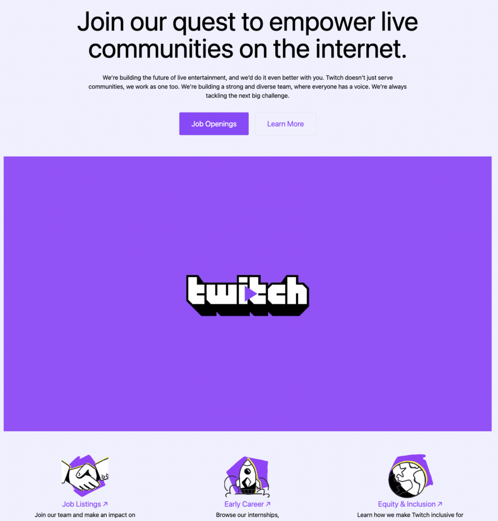
1. Twitch
Full transparency—I used to work at Twitch and always loved their careers page. It oozes Twitch's personality.
Visually, it’s bold and loud so immediately speaks to people that are OK with that. There is a good navigation menu at the top and bottom and separate headings for The Blog, Early Careers, and Equity and Inclusion. It also starts to introduce you to the company jargon and language in a non-intimidating manner.
Improvements: While purple is a good color, perhaps helping people with a visual impairment by having other contrast options would be nice. Additionally, more emphasis on the values and the mission would welcome people to the matter at hand rather than just the flashy visuals.
2. Critical Mass
I came across this careers page when researching for a careers page I was building previously.
I like the bold, simple design, how they focus on the values and highlight them in a few different ways, and highlight what the company gives back to the employees. Note the slick video that shows off those lovely offices as well.
Improvements: They go too all-in on values and therefore miss a trick such as highlighting some of the amazing work their employees have done already (only the seniors are highlighted) or anything about DE&I or CSR.

3. Deepmind
This is interesting because they include a lot of information about the culture, diversity, values, and teams. There is a general open roles button towards the top and very natural filtered navigation towards the bottom with all the teams highlighted.
Overall, the navigation is really well done and leads the reader through the information easily (although spacing could be worked on, I feel).
Improvements: They assume candidates have already looked at the "about" page on the general company website, so it doesn't go into enough detail about what the company actually does. Also, pay transparency should be applied to all jurisdictions not just California and NYC.

4. Hibob
Continuing the theme of HR websites here is an example that I think did better. The job openings are actually appropriately at the bottom so they are not hidden so that bit is well done. We shouldn’t forget that ultimately people are there to see roles, not just culture and all the rest of it.
The website is also really interactive, there are groups per role and per location, for example highlighting the international teams using mini-sites. There are videos to tell you more information “before you apply” and all of them made by real “Bobbers”.

Improvements: Seems like a small thing but the values carousel is quite confusing. It makes it look like there are more values but, in reality, it starts looping back around so be mindful that you are not overcomplicating things.
If anything, the rest of the website has so much info that making sure the values are presented in a simple way is really important. Salary information is also not posted so that needs addressing.
5. Fold 7
As you’d expect from a creative agency, Fold 7’s site is slick and polished with a strong POV. It instills from the get-go what kind of company you will be joining and every piece—from the copy to the images and even focus on the great dogs (all dogs are great dogs of course)—oozes the personality of the people and wider org.
A great touch is the copy on the Fox as their “spirit animal” of sorts, which again goes to show a bit more about them. I only hope they don’t ask people “What animal are you and why?” during interviews (that is not a productive interview question!).

Improvements: I think the nav could use a bit of work, for example the link from the “our culture” to “our people” to the actual job postings can be difficult to find.
Often these sort of parallax-type websites can be very visually striking but one must pay attention to make sure that ultimately candidates can access the roles. Once again, no salary information is available.

6. Pleo
An example of a company that has kept it simple yet insightful—very Danish! Being informative but still letting the quirkiness and personality shine through is important.
Even something as simple as having the same colour scheme and letting the doodles and iconography of the main site continue through the careers page is important to provide cohesion.

Improvement: For this one rather than change anything I’d start adding more content from employees themselves. Currently, it’s talking about the culture and perks but letting employees share their experience will really ground the values and culture in reality. Say it with me - Salary information is not posted.
7. Airtable
First of all, kudos to Airtable for having the “popular” tag next to the link to the careers page on the homepage—very cheeky but gets people who may not even be candidates to click through and get to know them as an employer.

This takes you to the first careers page that clearly displays the open roles and allows you to filter by department (there are like 3 CTAs).
If people want to see more about life at Airtable and their workplace philosophy it’s easy to find using the relevant links, but ultimately the focus is on the roles.
Improvements: A lot of the content is focused on the perks and benefits, but for a company that has a whole page dedicated to what kind of workplace they want to build, they really should highlight the meaning of the culture.
For example, what people can expect from leaders, how they need to show up for colleagues etc. This would match their philosophy of “Forging a new way of working”. Additionally, they only post salaries when it’s legally required. (e.g. no salaries for London or Germany-based roles).
8. Figma
As to be expected from Figma, they really tap into the creativity. There is some detail on culture, but the main focus is on the visuals.
It’s also a great initiative to highlight the communities, or as the HR world insists on calling them employee resource groups (which has always been a missed naming opportunity to me).

Improvements: Purely operationally, the locations are highlighted but you cannot filter the roles by location—something quite important for a global company.
Outside of that, there needs to be a fair bit more information on life at Figma and highlights of the people working there. The current focus on the culture and values is a good start though. Again, salaries are also only displayed in locations where it’s legally required.
9. PostHog - Superstars! ⭐
Moving back to smaller companies, I’m slightly in love with this whole website.
There are a lot of pages that support the main careers page and the information they’ve made available to candidates is top-notch.

Transparency seems to be the name of the game with these folks, so the job ads may be a tad on the longer side but they do contain a lot of good information and links to more info should people want it.
Because they’re global, they’ve even gone above and beyond regarding pay transparency by including a calculator. This is so much better than slapping the proverbial $60,000-400,000 range like Netflix does.
Improvements: There is almost too much information, which is rich from someone who happily went into the rabbit hole reading about another company’s roadmap! It almost leaves this feeling of a “too-well” functioning team.
I verified it with a few other people and all of us came away with the feeling of “Well where do I fit in as a candidate? They seem to have it all well in hand?”.
I’m sure there are gaps in each team and they can highlight that too. I admit I set the bar so much higher here than any other page I’ve mentioned above, but that is of their own making! Absolutely suffering from success.
10. Circuit
Continuing the trend of highlighting smaller outfits, here’s Circuit showing that you can still have transparency and lots of content without moving from Notion.
The page demonstrates great balance by focusing on their culture and providing insights into what this means in practice. For example, the fact that they don’t do scrum is so valuable to know and they link off to the project framework they have instead.
While Posthog above went all out with the design system, iconography, hedgehogs, etc, Circuit decided to go for something more straightforward. However, they still have a public handbook and similar levels of information, especially for a candidate who wants to apply for a role.
At the time of posting, there were no roles to look at but they promise pay transparency.

Improvements: Sometimes Notion does suffer from being a one-pager, so it’s a bit of a long-scroll hog. They do have the “Jump to” option, but I almost wonder if there’s enough content to justify a mini-hub with actual sub-pages.
It can be a navigation slog if you’re in the middle of the page and not super savvy with shortcuts. Perhaps something more like their handbook would be more user-friendly.
11. Wayve
Wayve has an interesting challenge when building their careers page. They have roles that go along with every modern tech startup, but they also have more “applied” science roles alongside even traditional blue-collar jobs like fleet managers and drivers.
On top of that, they need to tell a compelling story of why their AI self-driving car model is the future and how exactly they are bringing that from the theoretical into practice.
The main careers page focuses heavily on the story of Wayve and what they want to achieve in accessible language, which is a great move. Sometimes communicating your mission won’t be easy, so you need to strip it down to the fundamentals.
Regarding job descriptions, I couldn’t see any difference between the level of detail between job descriptions for drivers and machine learning engineers. This is so important to make sure candidates understand that everyone is part of the same team.
They also feature DEI information prominently and link off to their employee resource groups.

Improvements: The people profiles/testimonials could be a bit more diverse and the job adverts do need salaries everywhere, but overall a very clear, concise, and consistent careers page.
Careers Page Best Practices
1. Clear and engaging design
- User-friendly navigation: Ensure the page is easy to navigate with a clear structure that guides users to relevant information and job listings.
- Mobile optimization: Make sure the page is responsive and accessible on all devices as many users browse job opportunities on mobile.
- Visual appeal: Use a clean, professional design that aligns with your brand. High-quality images, videos, and graphics do wonders to make the page more engaging.
2. Compelling company overview
- Mission and values: Clearly state your company's mission, values, and what makes you unique. This helps potential candidates understand and identify with your purpose and culture.
- Employee testimonials: It’s effective to include testimonials or short videos from current employees to give an authentic view of the work environment.
- Company culture: Highlight aspects of your company culture, such as team activities, work-life balance, and diversity and inclusion initiatives.
3. Detailed job listings
- Comprehensive job descriptions: Clearly outline job responsibilities, required qualifications, and preferred skills. Be transparent about what you expect from candidates and what they can expect from the role.
- Application process: Provide a clear and straightforward application process. Include a FAQ section if necessary to address common questions about the hiring process.
- Easy application: Simplify the application process with a user-friendly form or by allowing candidates to apply with LinkedIn or other platforms.
4. Benefits and perks
- Competitive salary and benefits: Highlight key benefits such as healthcare, retirement plans, and bonuses. Transparency about compensation attracts more serious candidates.
- Unique perks: Mention unique perks like flexible working hours, remote work options, professional development opportunities, and wellness programs.
5. Showcase career growth opportunities
- Career pathways: Highlight opportunities for career advancement within the company. Include information about training programs, mentorship, and internal promotions.
- Success stories: Share stories of employees who have grown within the company to inspire potential candidates.
6. Clear language
- Clear job titles: These will be the best way candidates find your jobs so keep the “Code Conoisseur” titles for internal use only.
- SEO: Clear language and use of keywords, titles, tags etc can improve your search engine ranking as well, which can never hurt.
7. Inclusion and diversity
- Diversity statement: Include a statement about your commitment to diversity and inclusion and highlight any initiatives or partnerships related to this commitment.
- Inclusive language: Use inclusive language in job descriptions and other content to ensure they appeal to a diverse range of candidates.
8. Clear applications
- Clear CTAs: Include clear and compelling calls to action, encouraging visitors to apply, sign up for job alerts, or learn more about the company.
- Easy applications: Wherever possible, make applications simpler by parsing CVs and not requiring anything unnecessary like a cover letter if you’re not going to read it. Make the application button and route really stand out.
9. Regular updates
- Current listings: Keep job listings up to date, remove filled positions, and add new opportunities as they arise.
- Company news: To keep content fresh and relevant, update the page with recent company news, events, and achievements.
10. Analytics and feedback
- Track performance: Use analytics tools to track the performance of your careers page, including traffic, click-through rates, and conversion rates. Many ATSs or recruitment marketing software already have these in place, so make sure you use them.
- Feedback mechanism: Provide a way for candidates to give feedback on their application experience and highlight any improvements for the careers page and hiring process.
It’s Always A WIP
Creating a compelling careers page will take you time, it’s not something most people can put together in an afternoon. However, it’s worth the effort as it’s an important window for candidates into your company, culture, and mission.
Your careers page is crucial to help you attract the right people to your company, not just anyone! Having a point of view and being transparent from the get go will save you time down the line.
As you saw from the examples above, there is a balance of the content you can put forward so as to not make it overwhelming or too bland.
One resource I would really like to highlight is OpenOrg. I’ve worked with the founding team and can vouch for their dedication to helping companies be transparent and make their culture tangible.
If you’re not sure where to start with the above list of recommendations, take a look at their Open Source Resources!
Overall, do not forget to take your time, add more detail than you initially thought, and don’t be afraid to add personality!
Subscribe To The People Managing People Newsletter
For more on creating attractive careers pages and talent acquisition in general, subscribe to our weekly newsletter for HR and business leaders sharing knowledge and best practices to help you grow in your career and make greater impact in your org.

