I’ve been working with fast-growing tech businesses for the last 20 years helping them grow effective, scalable teams.
During this period, my teams and I leaned heavily on our people data to guide decision-making.
Here we’ll build on what we covered last time about building the foundations of your HR data and metrics and ensuring you have clear, auditable processes to support those metrics.
We’ll discuss how we take those metrics and use them to draw conclusions about organizational health and drive action from leaders.
As we take the next step, we need to think about what the trends are and what the data is telling us. Beyond that, we need to use the data to answer the business’s most prevalent questions.
We also need to think about our audience, most of whom are busy, so we need to make the data as digestible as possible and tell a story.
We’ll cover:
How to Collect Data
First, let's go over the basics. I won't spend too long here, except to say that you should pick your HR software with reporting in mind. HR data analysis is more effective with robust HRMS capabilities to handle large volumes of information.
Look for HR software with customizable reporting, real-time analytics, and data-driven insights to improve decision-making. Also consider advanced predictive analytics, benchmarking against industry standards, and integration with external business intelligence tools for deeper insights.
Using cloud HR software can also simplify HR data analysis by centralizing all relevant information in one access-anywhere platform.
Presenting Data In A Meaningful Way
There’s so much data we can gather but let’s start with the most fundamental metric—the number of employees. Giving a monthly number of people in the organization is useful.
428
But maybe it’s more relevant to show whether that’s up or down from last month/quarter/year:
382, 418, 420, 428….
But wait, a graph is better here, right?
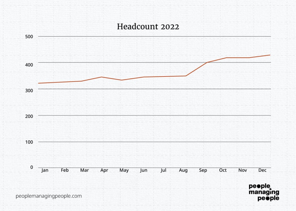
So here, at the most basic level, we have a trend line indicating that headcount is increasing.
We have a couple of months where it grew quicker and one where headcount decreased.
Why?
Let’s add monthly starter and leaver numbers, that will give us a better picture.
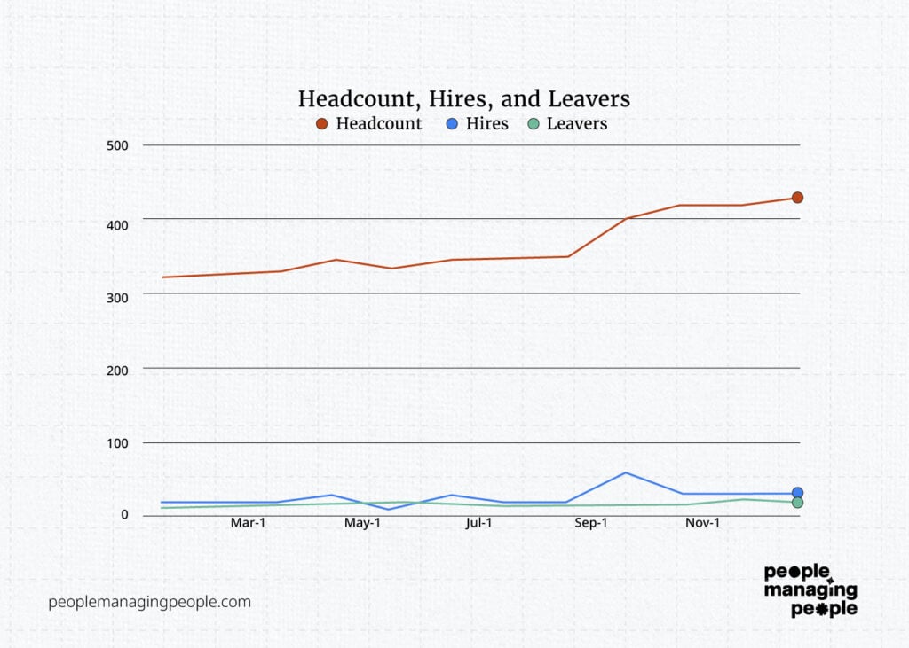
So we can see a peak there but comparing 15 and 400 on the same axis isn’t clear, so let’s adjust again.
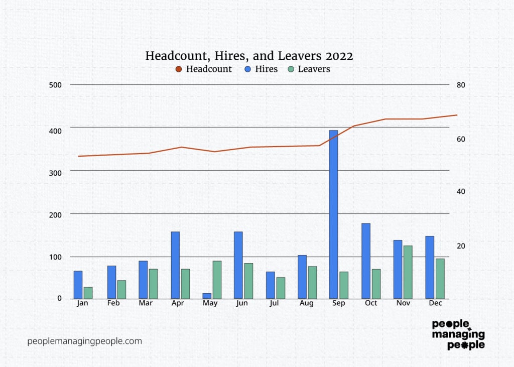
By changing starters and leavers to a bar chart, comparing them side by side each month and changing them to the right-hand axis, we’ve made this visually simple to understand.
Headcount is growing but hiring has been inconsistent month by month with September and May being anomalies. Can we explain that in our narrative?
We also need to make it clearer that that our graph has 2 vertical axes and also make the title clearer.
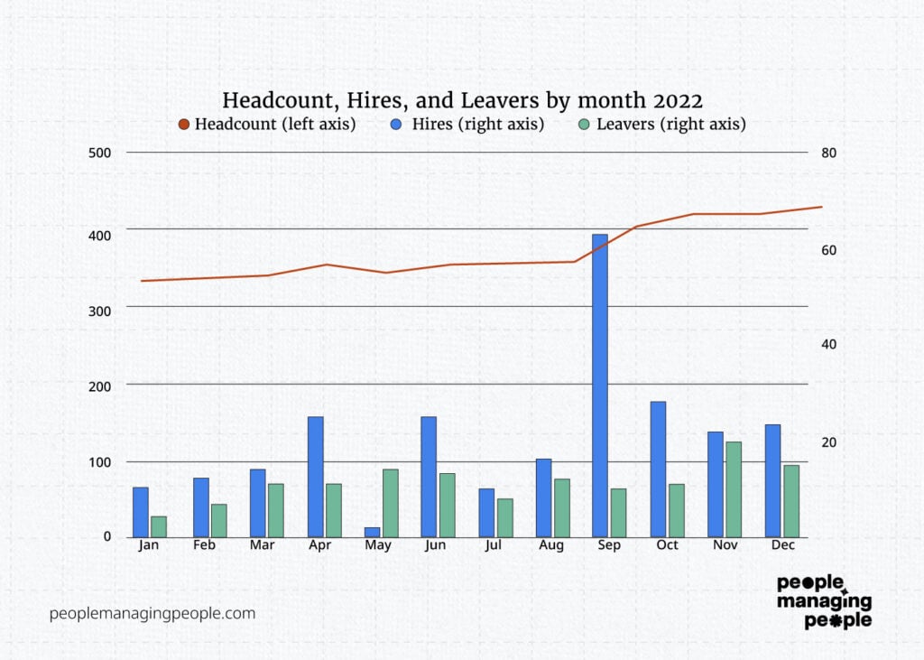
So what else can we see or what else do we need to see from this chart? It looks to me like there are more leavers in recent months, but also the business has grown, so maybe that’s to be expected. If we add attrition to the graph we will see a clearer picture.
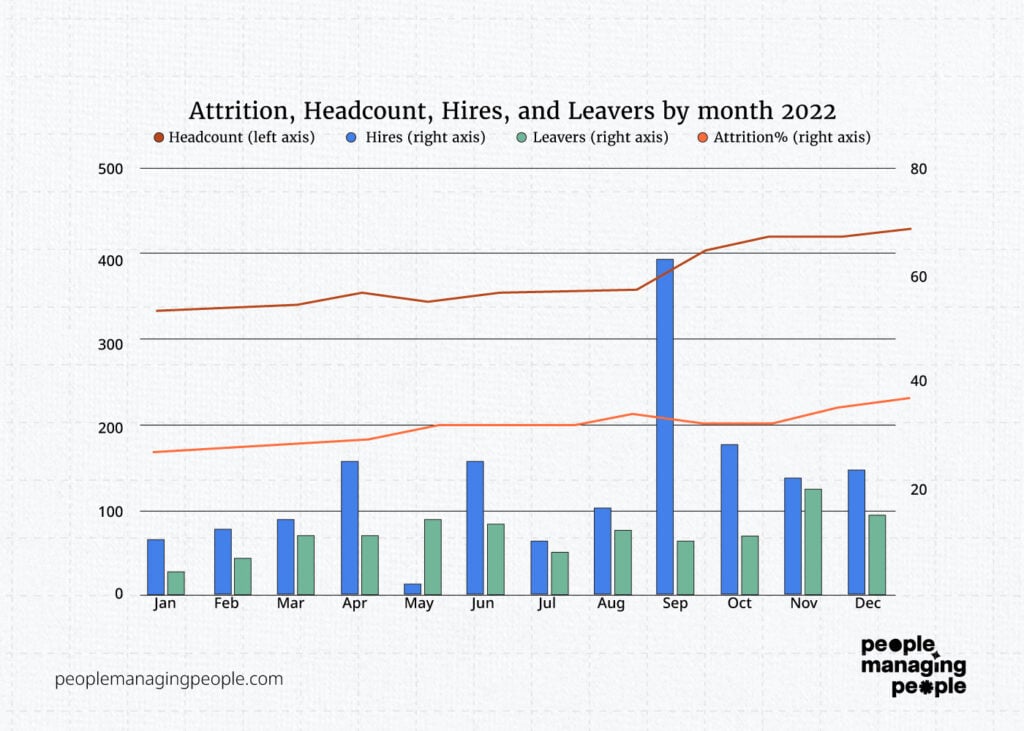
Aha! Now we’ve created a rich collection of employee data about this set of workers and we’ve shown in one graphic that hiring is spiky, headcount is growing, attrition is rising, and leaver numbers are increasing.
With limited text, we can “talk” to stakeholders about what’s happening in the organization and hopefully induce some action.
This is a good example of how, by building the basic data sets (headcount, hires, leavers, attrition) that we spoke about previously, we can show trends and perform basic analysis by using simple tools (these sheets are available to download here).
By looking at your data in its simplest form and asking yourself the question “What is the story I’m trying to tell here?”, you can develop prompts for yourself, play around with the layout of the graphs, and create visually impactful messaging for your stakeholders.
Data visualization is an essential part of HR data analysis. Modern HR software solutions often come with built-in analytics dashboards that can make this task easier.
You can even play around with tools such as ChatGPT to help you with your analysis. For example, if we take the graph above and just say what we see, then we can ask ChatGPT to make it concise.
“Headcount has grown from 320 to 428 in the last 12 months, 2 months (September and October) had the highest number of hires with 63 and 28 respectively, November saw the highest number of leavers with 20 and attrition has risen from 27% to 36% throughout the year”
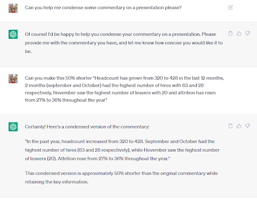
As you can see, by quickly inputting the key points into a tool like ChatGPT, you can generate a concise version of your commentary in less time than it would have taken you to rewrite it yourself and your stakeholders will be impressed (here are some useful ChatGPT prompts for HR to help).
Speaking of which, let’s take a moment to think about our stakeholders and flesh out this example a little further.
Building Personas For Your Data
If we continue with the above example, what additional data can we add to explain what is happening?
An obvious example would be the type/location/demographics of the roles that have been hired, particularly in the spikes (e.g. could this be an annual graduate intake?).
The other obvious area is who is leaving (roles/location/demographics), what are their reasons for leaving and have they changed over time, and do they match with what people are hearing on the ground?
For example, pay is often cited as a motivation for leaving but measuring this through leavers is a lag measure (e.g. very much after the event) as the people have already looked for another role, found one, resigned, and worked notice.
So, if you’re seeing lag measures highlighted, we need to find ways of getting more real-time data through your employee listening methods.
Now it’s starting to get a bit deeper and more complicated so we need to think carefully, not just about the data but also the conversation we’re trying to prompt and our audience, and that’s where using internal personas comes into play.
Personas are often used by marketing teams to paint a picture of their target customers when building out marketing campaigns. They become quite complicated, but we’ll have a simple usage here.
I’ll show you a few examples of the personas that have worked for me in the past, the assumptions you can make about that group, and then the data they’re likely to want to receive and the manner in which it’s sent.
Internal personas examples
Executive Management Team persona
This group has limited time and needs to understand the longer-term impact of what our people data is telling us about organizational health and progress toward key strategic goals.
They are also a manager of a team/function, so they also need a high degree of detail about that.
| About | Adaptations |
| Busy | - Don’t rely on self-serving data, put it in a deck and send it with a follow-up. Take time to give commentary and explain - Be concise in what you present by ensuring everything you include is relevant and keep it as short as you can. |
| Focused on financials and a high-level, broad view of the organization | - Focus on the metrics that relate to financials - How do metrics link to broader strategic aims? E.g. are you trying to grow? Are you trying to reduce the number of managerial roles? |
| Data and business savvy | - They’re used to complex information represented well, take more time with this |
| Need a detailed view of their function | - Detailed representation of their function including hires, leavers, attrition, spans, layers, diversity, learning, engagement, demographics, and employee relations - Provide information tailored to their function, ideally with the rest of the organization as a benchmark |
Managers persona
Managers need to be broadly informed about the organization to provide them with context about their teams and role (so lots of high-level, easily accessible data).
They will be onboarding new joiners to the company and interviewing prospective people, so they need to know the basics and a bit more—enough to be able to start to tell a story.
| About | Adaptations |
| The group is varied across different locations, teams, and seniority | - Need solid, high-level data easily accessible- Need to know where to find more specific data about teams, locations, etc - Give some information, but you can also rely on self-service for those looking for specific information |
| Need to be informed | - Less focus on telling them what needs to change at an organizational level, but still give them the information to make their own inferences |
| Need to guide interviews and onboarding | - They need to know who we are—the fun facts about the organization e.g. demographics (see below) |
Employees persona
Similar to managers in that they need a broad overview but with likely less detail.
| About | Adaptations |
| Group is varied in different locations, teams, and seniority. | - Need solid, high-level, easily accessible data - Give some information but can also rely on self-service for those looking for specific information |
| Need to guide interviews and onboarding. | They need to know who we are—the fun facts about your organization |
Human resources personas
Your HR team needs different information from the employee and manager community as they are developing strategies and explaining the story.
For example, the business may want to know the average number of job applications per vacancy, or the total figure of applications in a given month, but your talent acquisition team will need to see this data on a per-job basis and would also like to see the incomplete applications and hits to the careers site so they can effectively manage the funnel of applicants.
They can then look at things like overall recruitment marketing effectiveness or the particular job descriptions to see if they need to make any adjustments.
| About | Adaptation |
| HR Leaders and Analysts | - Need access to the appropriate data to be able to draw conclusions and develop insights |
| HR Business Partners | - Need access to data specific to their role/client group |
I’ve found building personas extremely helpful for being clear about why we’re sharing particular data and what the purpose of it is.
These four simple persona examples above demonstrate that, from the same core data set, we can provide the same data with appropriate commentary, calls to action, and differing layers of detail.
Using our example of the attrition, hires, leavers, and headcount from earlier, this information would be most applicable to the exec management team (both company-wide and for their functions), Managers (company-wide but show them where to self-serve their teams if applicable) and HR (access to self serve by role type).
By using the personas in this form, you get real value from them and it saves a lot of time and effort.
If you take the 40 KPIs we looked at previously you can map them to the personas—here’s a quick example from the recruitment metrics part of that article:
| KPI name | EMT | Managers | Employees | HR |
| How many people are you hiring and in what location/executive department? | Yes for company and function Yes for specific org they lead and any additional info if you have it | Yes for company and function | Yes for company | Talent Acquisition: all the details Business Partners: all the details for their function Rest: Yes for company and function |
| How long is it taking you to hire someone for specific roles? | Yes for relevant roles to strategic goals in the organization Yes for the high-level number | No but allow self-service | No | Yes for Business Partners and Talent Acquisition |
By doing this you’re building out a simple database of who needs what and why. I would also keep the method of calculation, data source, visualization, and underlying/audit process for each of these so you have everything in a single easily accessible place.
Having Some Fun
I want to dive into another example here that is relevant for all your businesses and even people outside of it as well—how do we show our company demographics?
When telling a story about a business, I’ve always found that what people find the most interesting is “who we are”, and the “stickiest” fact I’ve found was the number of nationalities at a company.
So let’s take some simple examples.
- Gender
- Nationality
- Age
- Tenure
Let's assume we have the data on this (all the data shown here is imaginary by the way).
- Gender. 45% male, 55% female
- Nationalities. (13 Total) Top 3: British 59%, French 12%, Italian 8%
- Age. (Average 34): <30 42%, 31-40 28%, 41-50 27%, 51+3%
- Tenure. <1 year 26%, 1-2 24%, 2-3 22%, 3-4 12% 4-5 6%, 5+ 10%
All clear but not very engaging, is it?
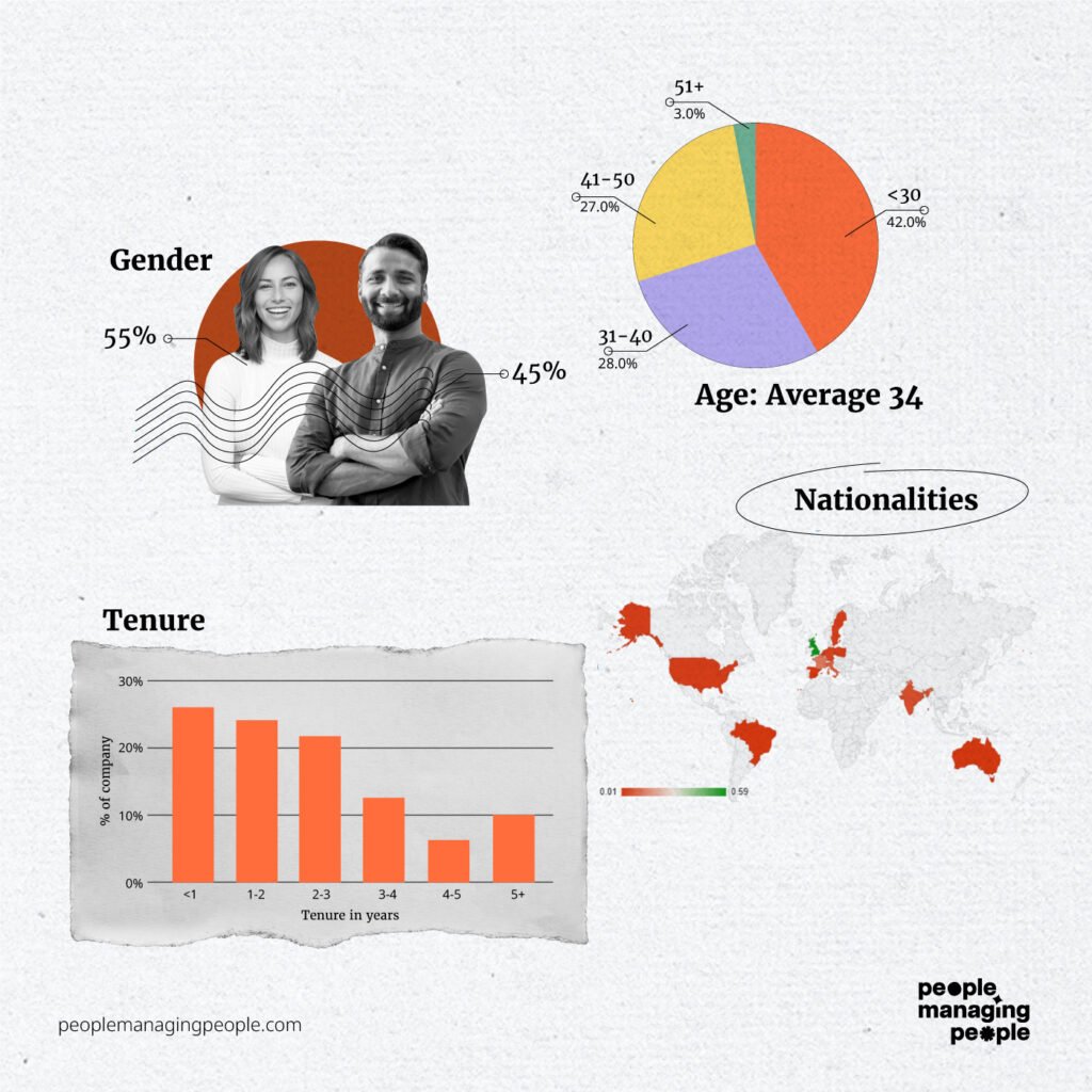
By using 4 graphs that came from Google Sheets or Slidesgo (both free), within a few minutes you can turn a list of numbers into something that’s engaging and tells a story about your organization.
These types of visualizations can be used for another persona—those outside your company— and can be posted on your website and other external-facing channels to showcase your organization to the wider world.
They can also be used internally and split by country/function/department to give rich insights internally.
Pictures and graphs are easy to deliver in this way and do not require much experience, you really just have to play about with it, and there are hundreds of free Youtube videos or demos on the web of how to do it.
Utilizing HR information system capabilities this way for data analysis can improve decision-making and strategic planning.
Using your data like this will engage your users and give you the feedback you require to move on to what’s next.
HR Metrics and AI
Artificial intelligence (AI) helps make sense of HR metrics by spotting patterns or trends faster than people can. For example, AI can predict if an employee might leave the company or suggest ways to improve hiring processes. By using AI, HR teams can make better decisions that improve employee satisfaction and company success.
Here are some examples of how AI can be used for HR analytics:
- Predicting employee turnover: AI can analyze patterns in employee behavior, such as job satisfaction scores or absenteeism, to predict who might leave the company.
- Improving recruitment: AI tools can quickly sift through resumes, ranking candidates based on qualifications, making the hiring process faster and more accurate.
- Employee engagement analysis: AI can analyze surveys, emails, or chat data to detect employee sentiment and offer insights on improving workplace morale.
- Performance tracking: AI can monitor performance metrics, such as project completion rates, to highlight top performers and identify those who may need support.
- Diversity and inclusion insights: AI can help HR teams analyze hiring and promotion trends to ensure diversity goals are being met and bias is minimized.
- Learning and development recommendations: AI can suggest personalized training programs for employees based on their skills and career goals.
- Absenteeism forecasting: AI can predict patterns in employee absenteeism and suggest solutions to reduce time-off issues.
- Compensation analysis: AI can help HR teams review pay structures to ensure fairness and competitiveness in the market.
Many enterprise-grade HR systems use AI-driven analytics to unlock actionable insights from HR data.
Key Takeaways
So, across the two articles, we’ve covered how to:
- Audit and record our data effectively
- Use personas to identify who needs to see what
- Take numbers and use simple or more advanced visual representations to simply our data
- Try new things with our visuals to make them more engaging including using free web resources
- Identify certain key pieces of data that most or all people need to see, even if it’s cut slightly differently
- Identify basic trends in key data.
You’re now in a really good place to start to be consistent with what you’re telling your audience. When you get to the point where you can:
- Calculate most of the 40 key metrics
- Turn the attrition, headcount, hires, and leavers into visuals and cut it by each relevant group
- Share key demographic data visually for each persona
- Distribute this information regularly (monthly or quarterly depending of your needs)
- Build an interactive HR database/spreadsheet for your metrics, their methodology and who they’re shared with.
You’re telling your business an interesting story and prompting each persona with a different set of questions that they have the opportunity to give you feedback on.
Even if you have complex problems and questions, starting with the basics and building steadily on top of that is the right way to go. Month by month, you can add new pieces of data and new charts to tell an increasingly richer story.
The same principles apply if you have a slew of tools and systems that are churning out reports for you; take the time to make sure calculations are consistent and understood and the basics are shared with the right personas in a consistent way.
The key takeaway from this is that, once you commit to making a start with metrics and analysis, you can get a long way quickly without being a data expert and you’ve got the foundation for more hardcore people analytics in the future.
The tools are out there, you just need to bring your subject matter expertise about what the data is and your business acumen to find out how it can help.
This will help you find the right way to share in as digestible a way as possible, and no doubt you’ll have fun on the way and certainly learn more about your business.
Some further reading to help you along your data journey:
- What Is People Analytics: An Introductory Guide
- Best People Analytics Conferences in 2024
- 29 HR KPIs To Help You Meet Strategic Goals
- The Metrics You Should Be Tracking To Improve Your Talent Management Strategy
- Top 15 HR Analytics Certifications
- 10 Best People Analytics Software for Workforce Analysis
- Unleashing the Power of HR Dashboards: Essential People Analytics Metrics to Track
- 10 Best HR Analytics Software for Actionable Workforce Data
- 10 Best Business Intelligence Software for Data Analytics


